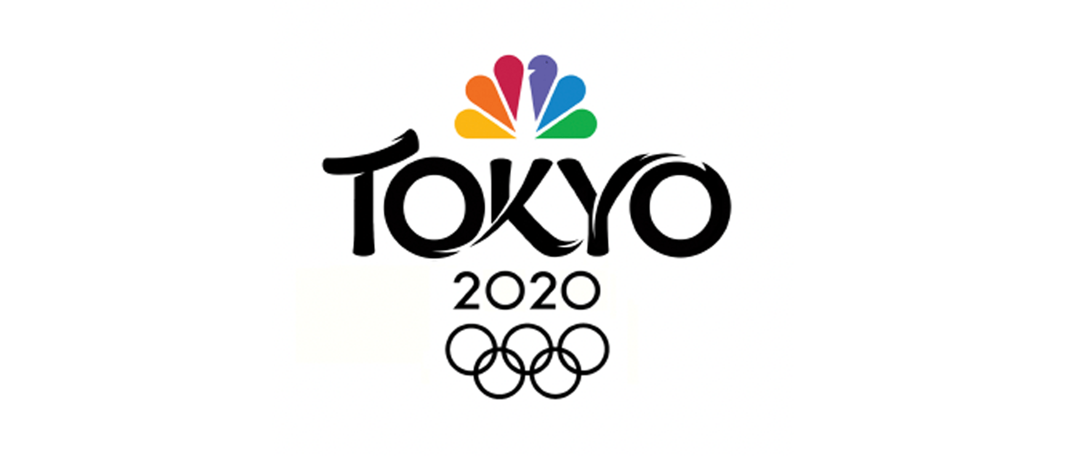
For the 2020 Tokyo Olympics, NBC Sports wanted to create a historic mark that had its own identity while also referencing the history of the host city without being overly traditional. MOCEAN was brought on to brand the historic games. Our task was to combine the Japanese aesthetic with the contemporary excitement of the Olympic games.

Grounding the Olympic Designs in Research and Japan
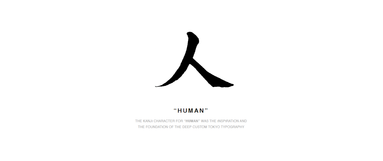
We worked closely with NBC Sports throughout each stage of the process. The project began with intensive cultural reference research and initial creative development. Stylistic wave motions, Japanese accents and architecture, and traditional ink calligraphy became central inspirations for the logo design direction. The Japanese Kanji character for “human” became a central figure and foundation for the typography.

When the first round of logos came to life, discussions followed about what resonated with the client around the original designs. While some agencies like to be protective over big design reveals, MOCEAN’s best creative work stems from continuous client dialogue and partnership.
The feedback gave our teams invaluable direction. Typography was placed on products and in varying contexts to provide a holistic picture of how the logo would interact in different environments. This further helped put the mark into perspective. From there, NBC Sports picked their favorites and it was on to the next stage where we honed in on the details that would give the logo a fluid energy.
We’re inspired by our clients, whether it be the artistic vision they bring or the way they speak to the emotional theme. Collaboration provides us the tenacity to keep returning to the well. That’s the path to the best work. Inspired design through client collaboration has been the cornerstone of MOCEAN’s culture. Developing the Tokyo Olympics logo with NBC Sports was no different.
Refining the Tokyo Olympics Mark
The client influenced every aspect of design development, helping push the logo to evolve and capture the essence of the games. We wanted to portray athleticism and movement throughout the mark. From the incorporation of a tiny nick in the Y to brushstrokes that give it an upward trajectory to a windblown directionality to the perfect “O” shape that spoke to the Olympic rings, hours of work refined the final product.

The attention to detail between NBC Sports and MOCEAN fostered a beautiful back-and-forth. The right balance between the weight of the strokes and the spacing between symbols was finally struck. While the logo retains its cultural references, it’s rooted in contemporary athleticism and the joy of the games, reflected in the flow of movement from one character to the next.
Unlike most corporate logos, which have the luxury of time to build public perception and resonance, the Olympic logo had a short lifespan. The limited timeframe necessitated that our work generate immediate impact. It was the opportunity to brand a historic moment in time, the first major athletic competition since the onset of the pandemic. A time in history that will not soon be forgotten. The client was thrilled with the end result. The final honor: to have the NBC Sports 2020 Olympics logo broadcast to millions all over the world.
